Branding for Dr. Anita Pillai – Advance Ultrasound Clinic
Care. Commitment. Excellence.
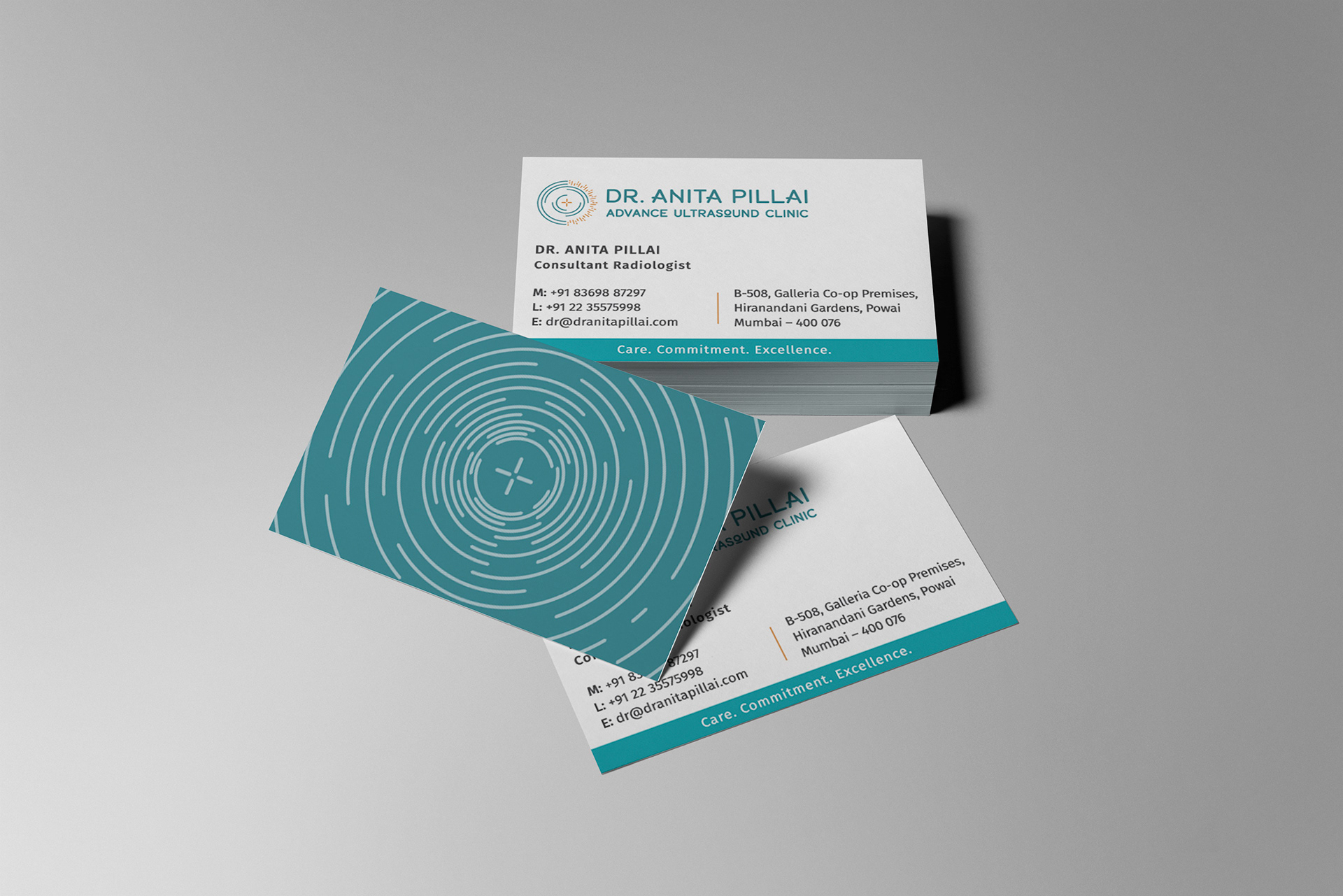
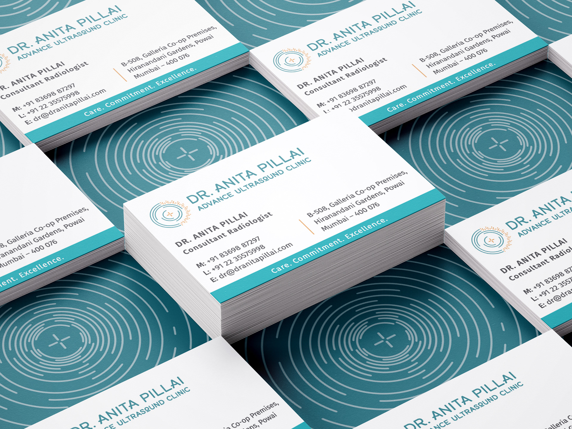
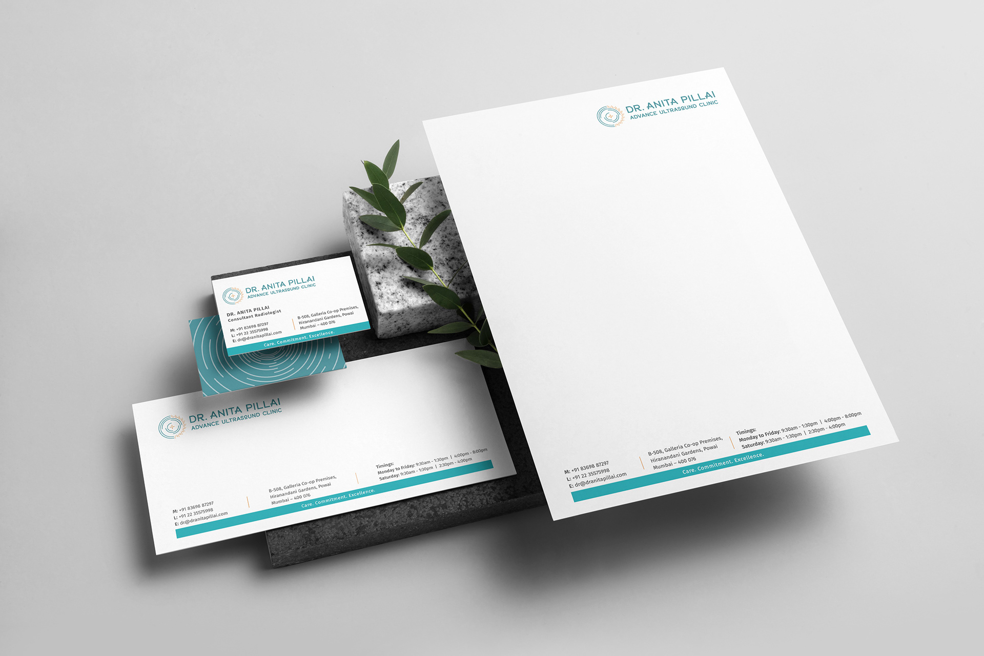
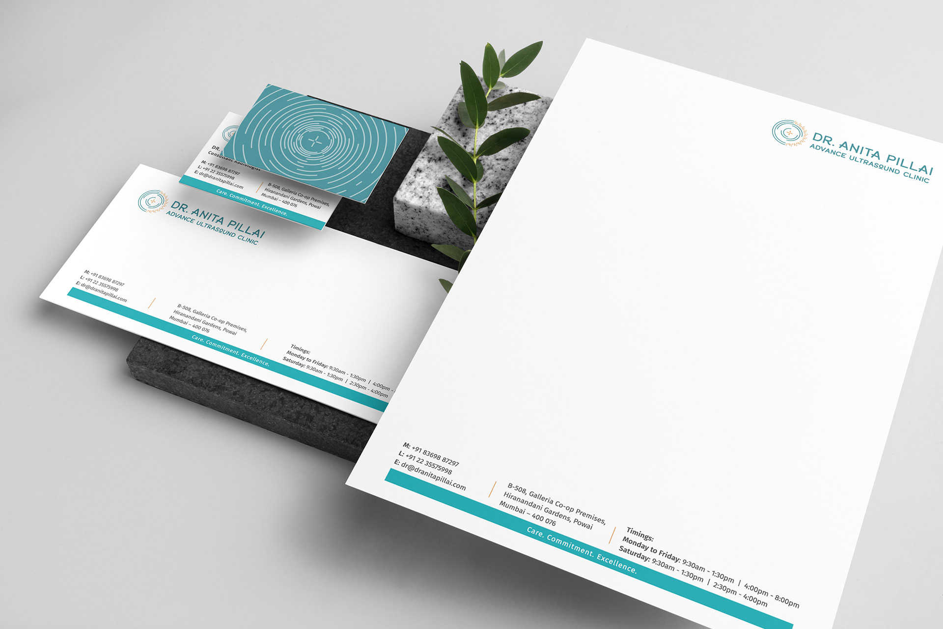
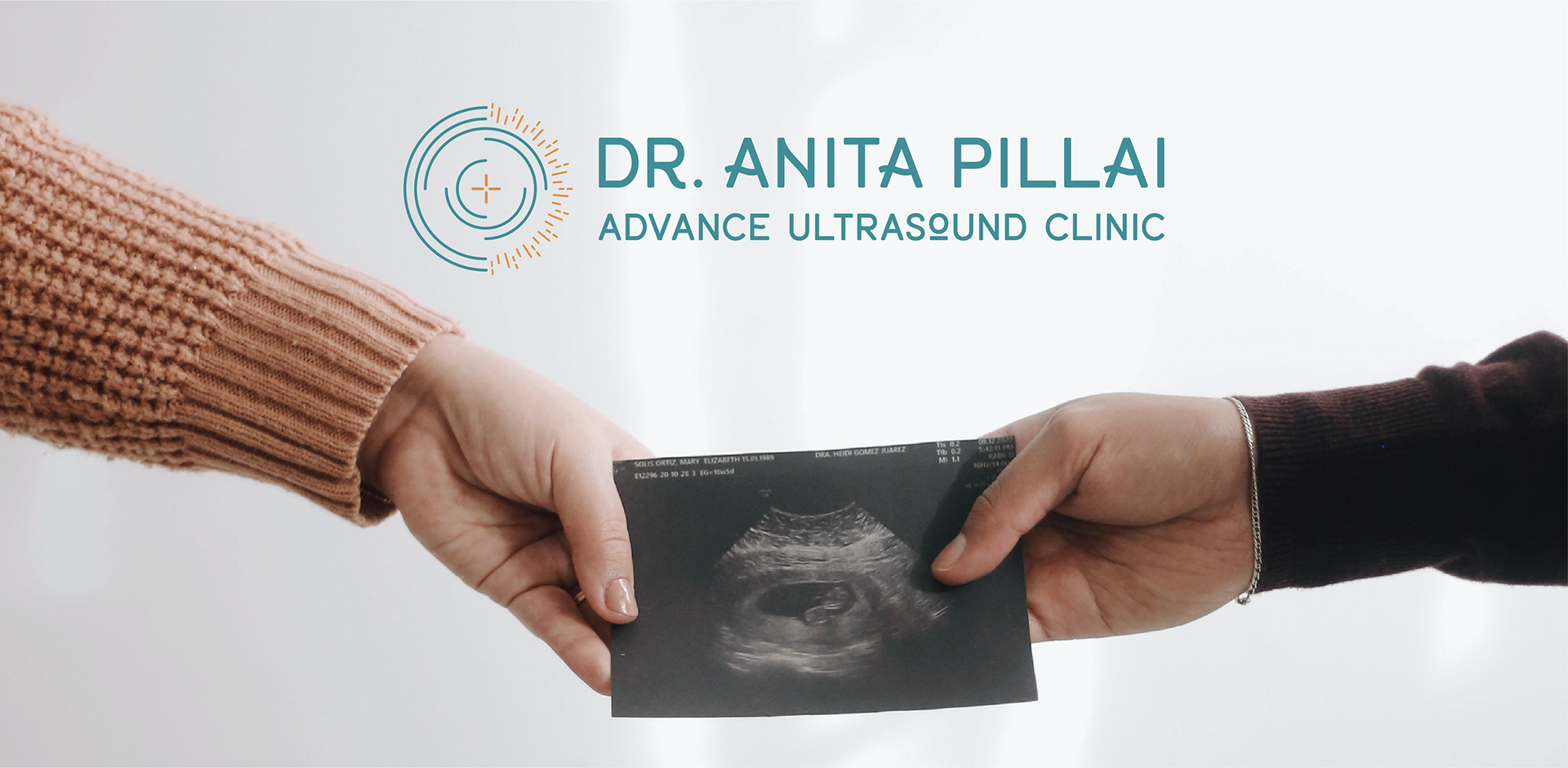
Dr. Anita Pillai Advance Ultrasound clinic offers all forms of sonographic studies and has a vision to use the doctor’s knowledge and experience to provide advance high quality and cost effective services in sonography to facilitate accurate, effective and timely diagnosis, which in turn will assist in further management and optimal treatment. The clinic focuses on high quality service in optimal hygienic conditions and with high accuracy rate. With the clinic’s popularity and by promising it’s position in the market, Dr. Anita Pillai wanted to give her clinic a new brand image, entrusting us with the creation of new brand identity. The new identity comprises of minimal, simple, clean and smart graphic language revelant to the medical sector distinguished by the selection of deep aqua green colour and waves patterm present in all media.
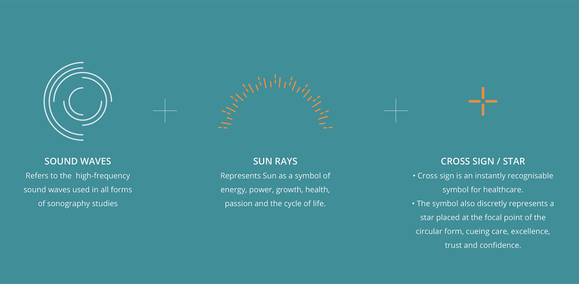
The logo concept comprises of these elements:
Sound waves –
- Graphically represents the core services of the clinic – all forms of sonography studies.
- Refers to the use of high-frequency sound waves that are beamed into the body and bounce back (echo) off tissue and organs. These echoes generate electrical signals that are translated by a computer to produce images of the tissues and organs.
Sun rays –
- The sun is a symbol of energy, power, growth, health, passion and the cycle of life.
- The sun is revered because of its ability to create life on Earth, cueing the vision of the clinic to provide advance high quality and cost effective services in sonography to facilitate accurate, effective and timely diagnosis, which in turn will assist in further management and optimal treatment.
Cross sign / star –
- Instantly recognisable symbol for healthcare.
- The symbol also discretly represents a star placed at the focal point of the circular form, cueing care, excellence, trust and confidence being at the center of the services provided by the clinic.
- Stars are often regarded as protective symbols. Stars represent distant divine force or energy, commonly depicting something good and positive.
Word mark –
- The font has a visual play in the letters ‘R’, ‘A’ and ‘N’ with a wavy line, reinforcing the core services of the clinic.
- The font has a visual play in the letter ‘O’ stressing the word “Ultrasound’, while also indicating the nature of the clinic of being up-to-date with the latest advancements.

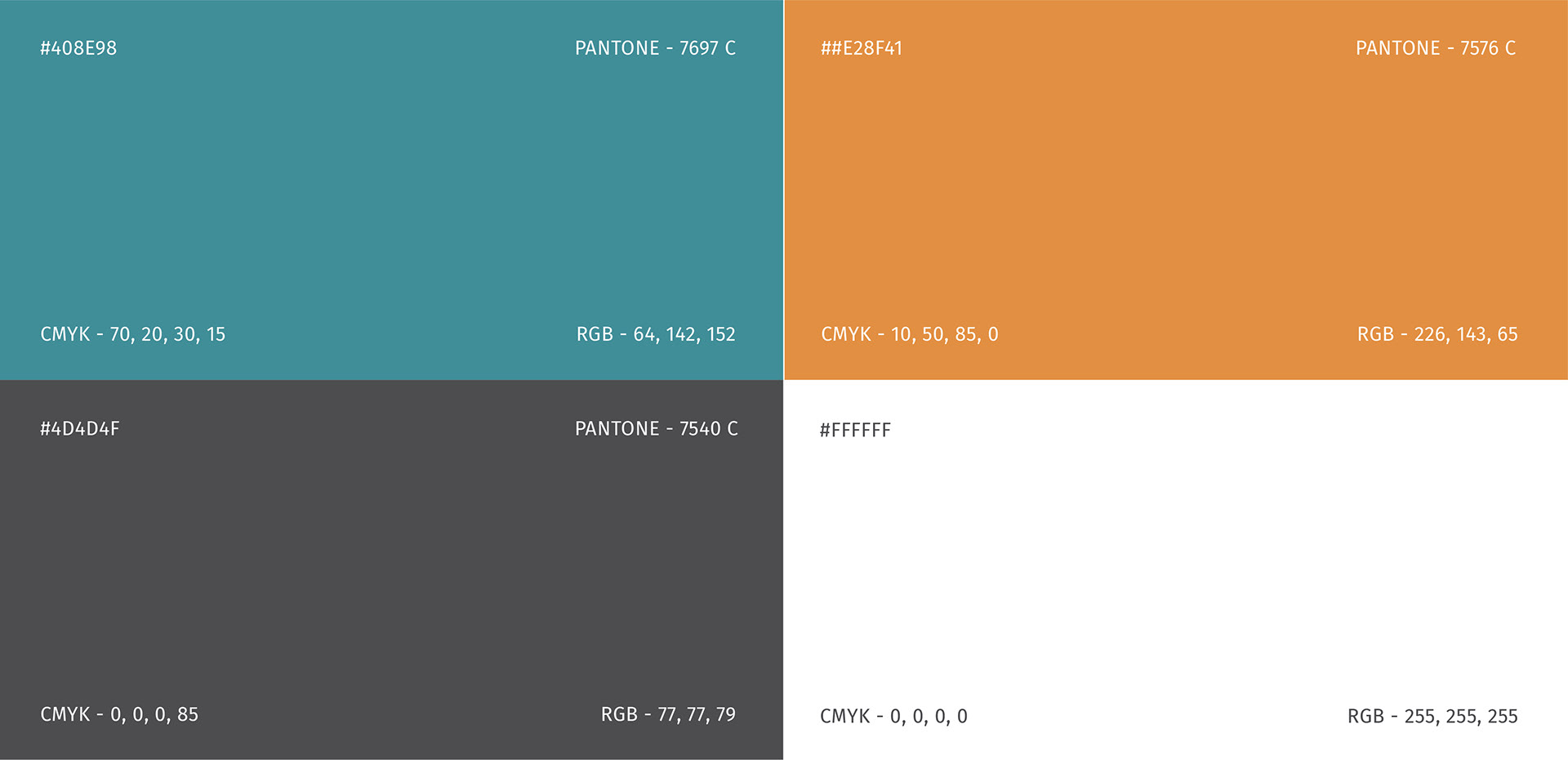
Golden orange –
Deep aqua green –

