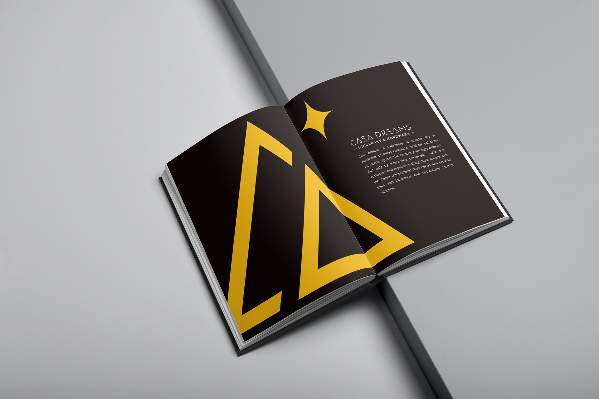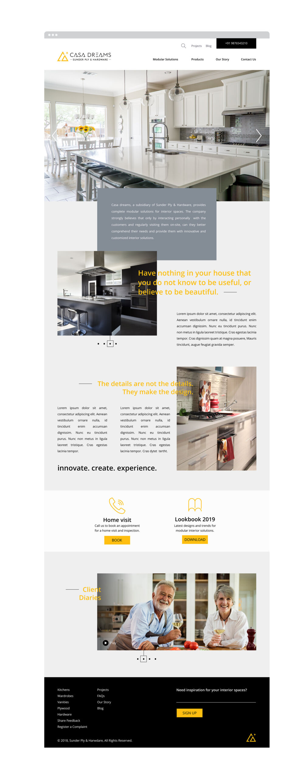
Casa Dreams, a subsidiary of Sunder Ply & Hardware, provides complete modular solutions for interior spaces – kitchen, wardrobe, vanity, plywood & hardware. The company strongly believes that only by interacting personally with the customers and regularly visiting them on-site, can they better comprehend their needs and provide them with innovative and customised interior solutions.
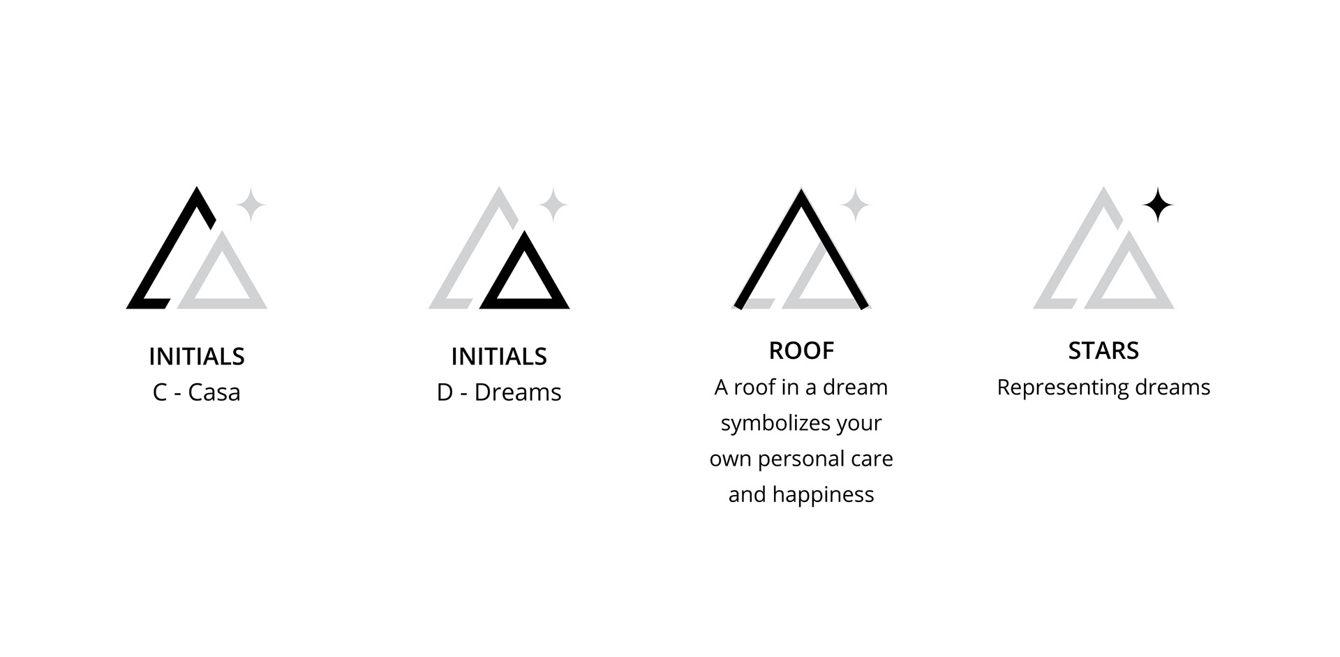
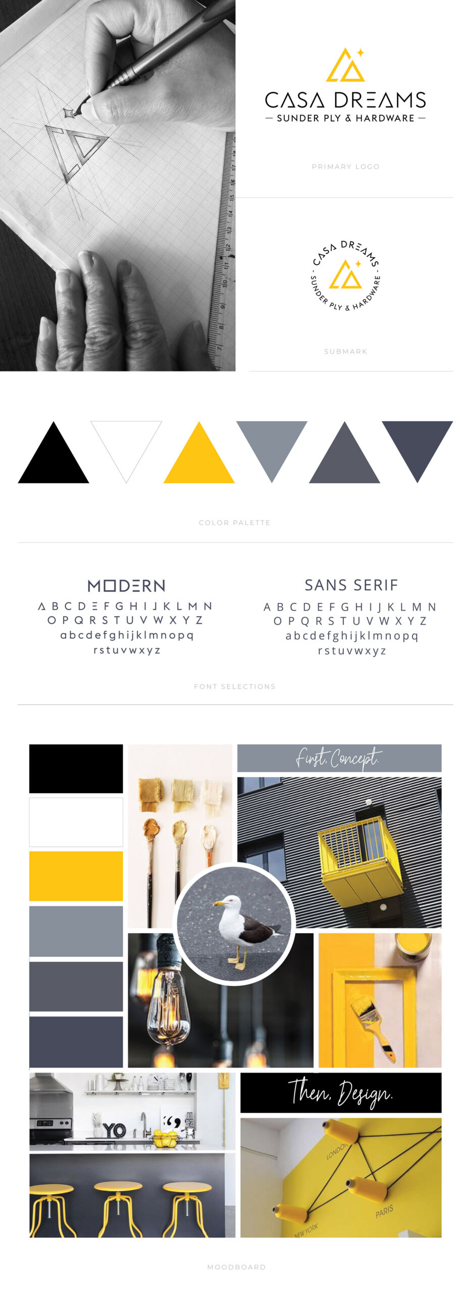
This quote is now the drive for the company’s founders to deliver high standard, amazingly beautiful interior spaces with highest precision, minimalist designs and excellent craftsmanship. I, being myself into details and minimalism in design, I could well relate with the brand. Once we, client and myself, were on the same page, I built a holistic brand system for the company, that was instantly identifiable and efficient for implementation.
The colour palette used for the brand was a combination of Chrome Yellow and tints of Black. Yellow being a cheery, warm and optimistic color, it has the benefit of being bright enough to grab a consumer’s attention from a distance. Black depicting business and luxury, conveys sophistication and a hint of status.
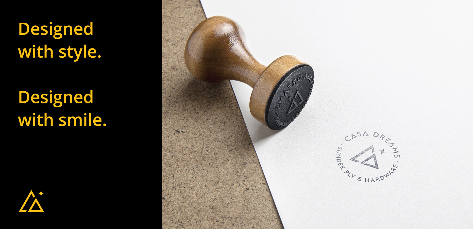
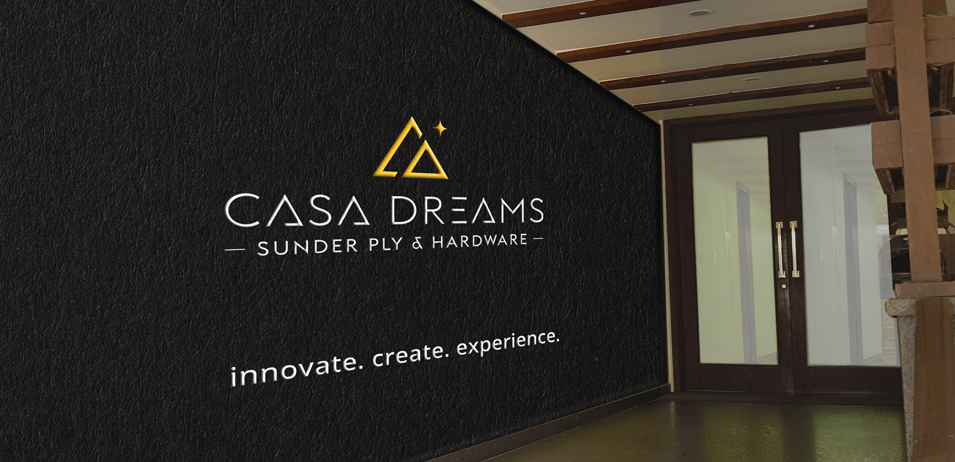
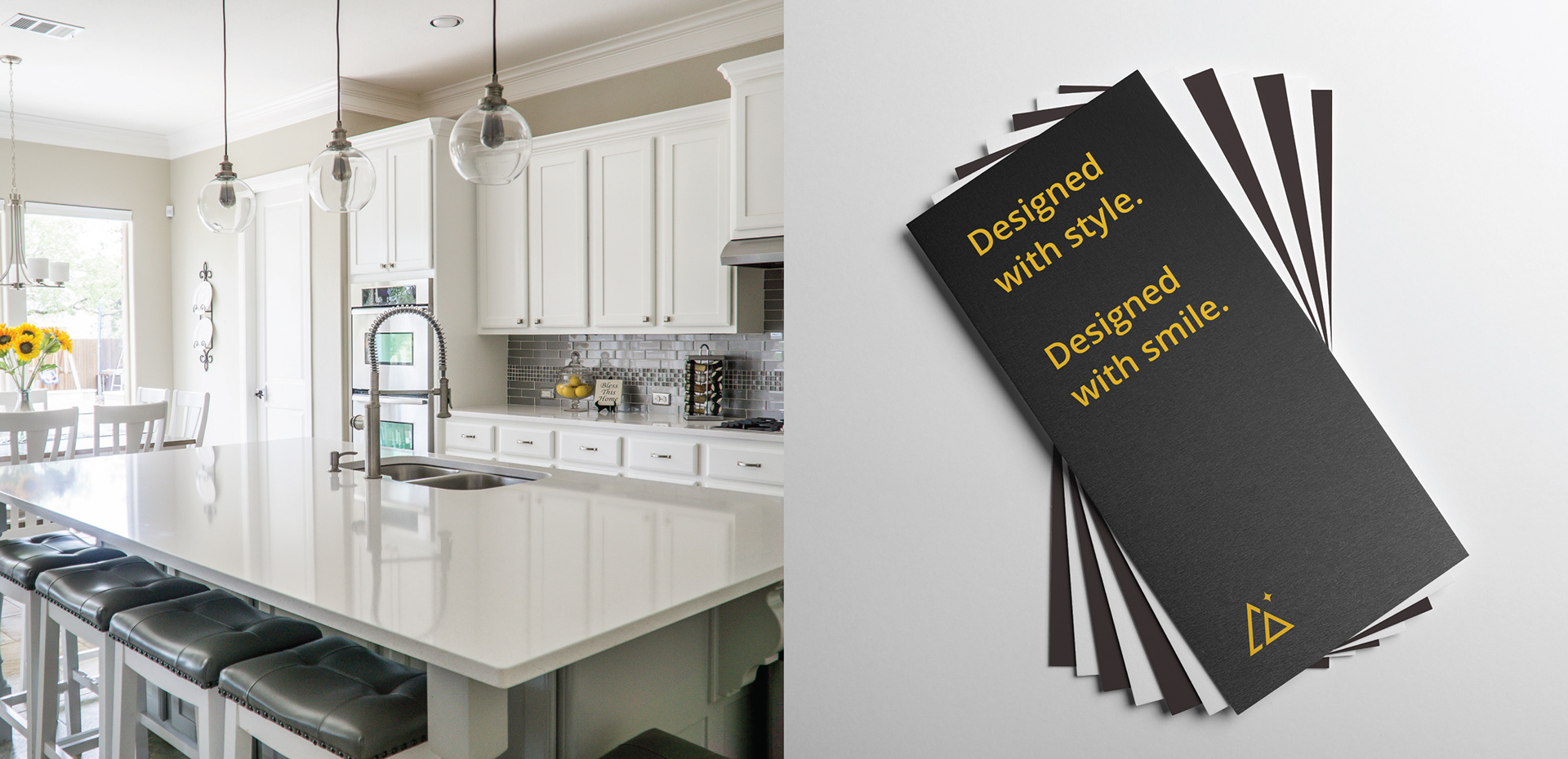
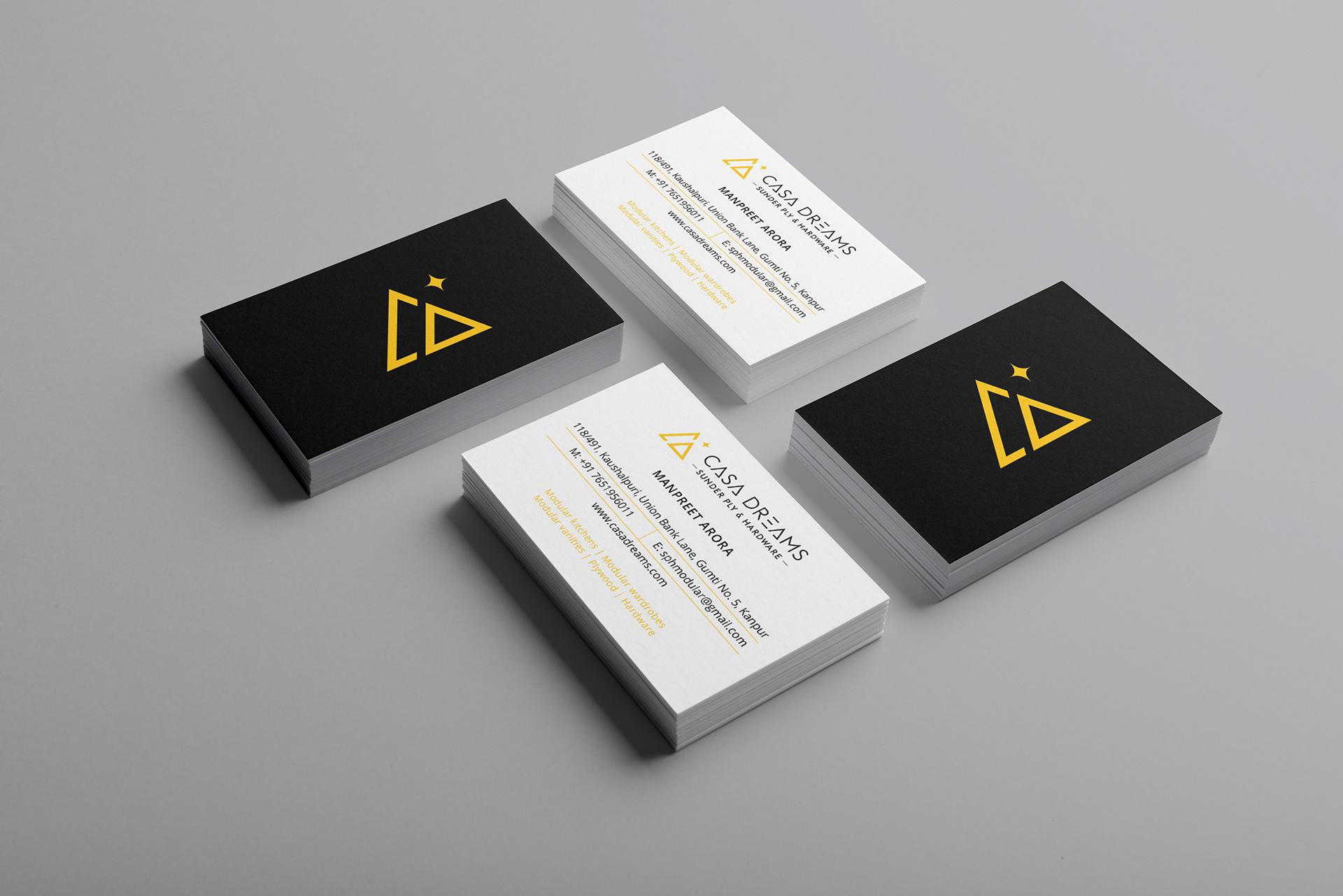

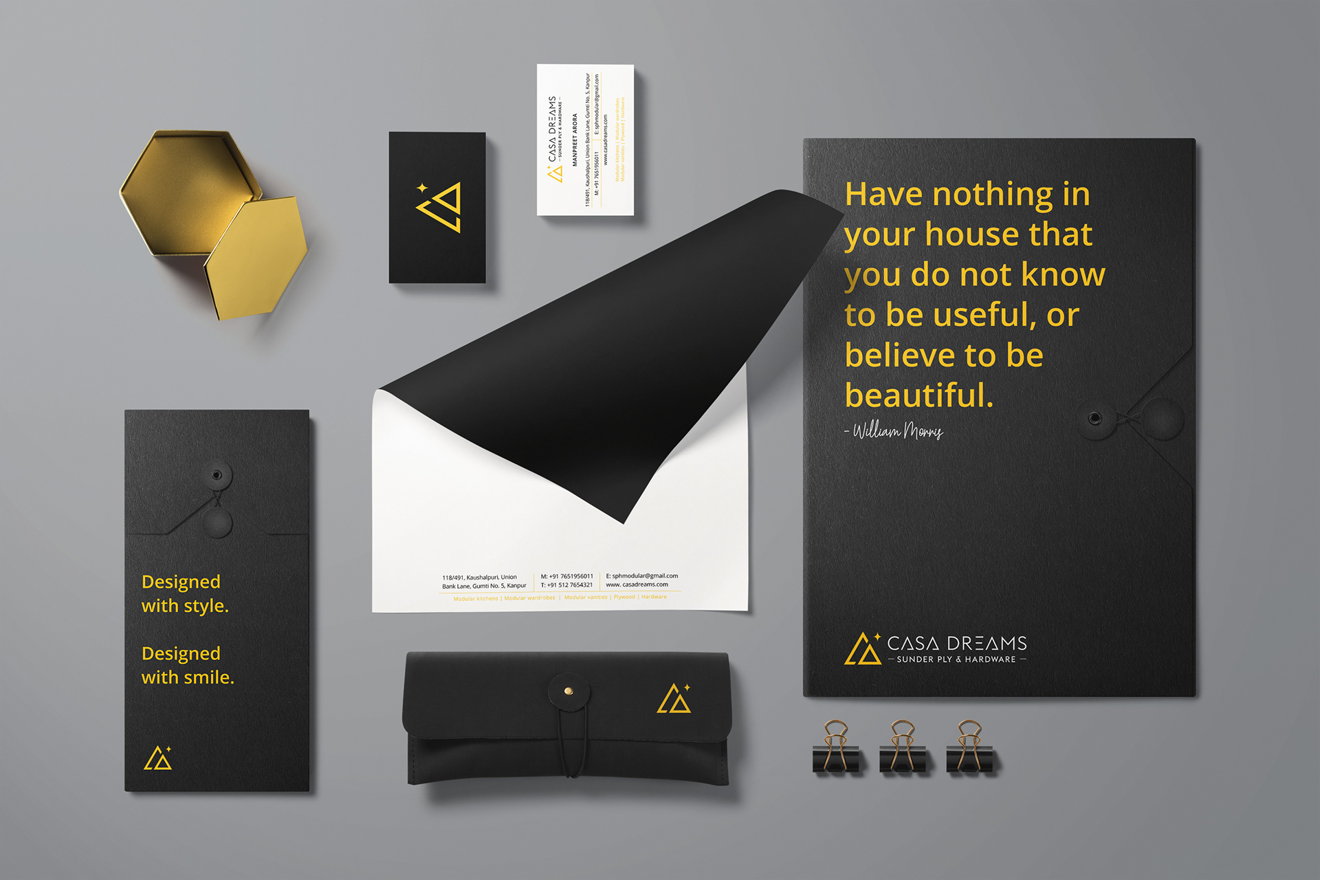
As proximity to the customers has always been a key component for the company, this approachable feel can be sensed in the visual concept of the brand I designed.
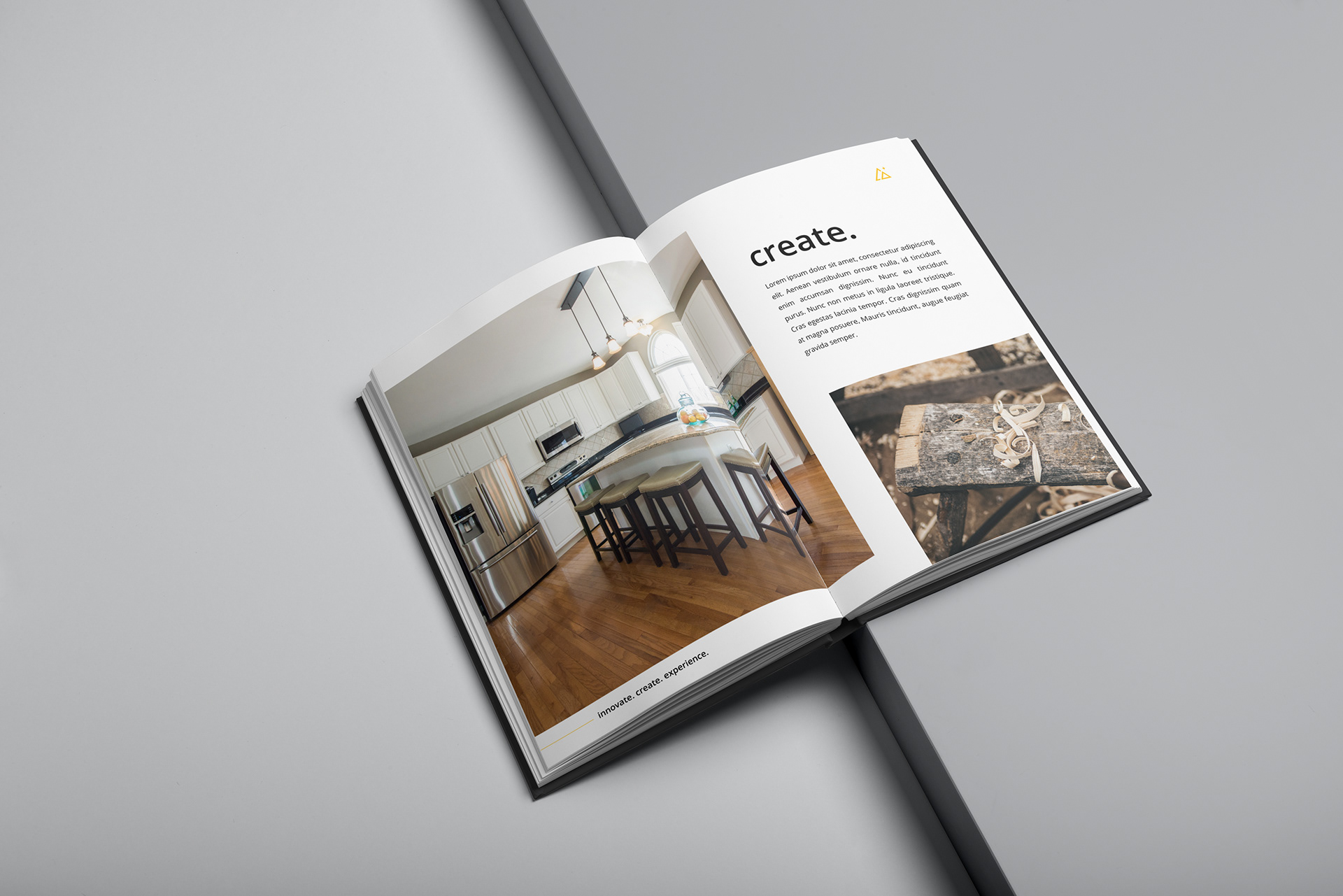
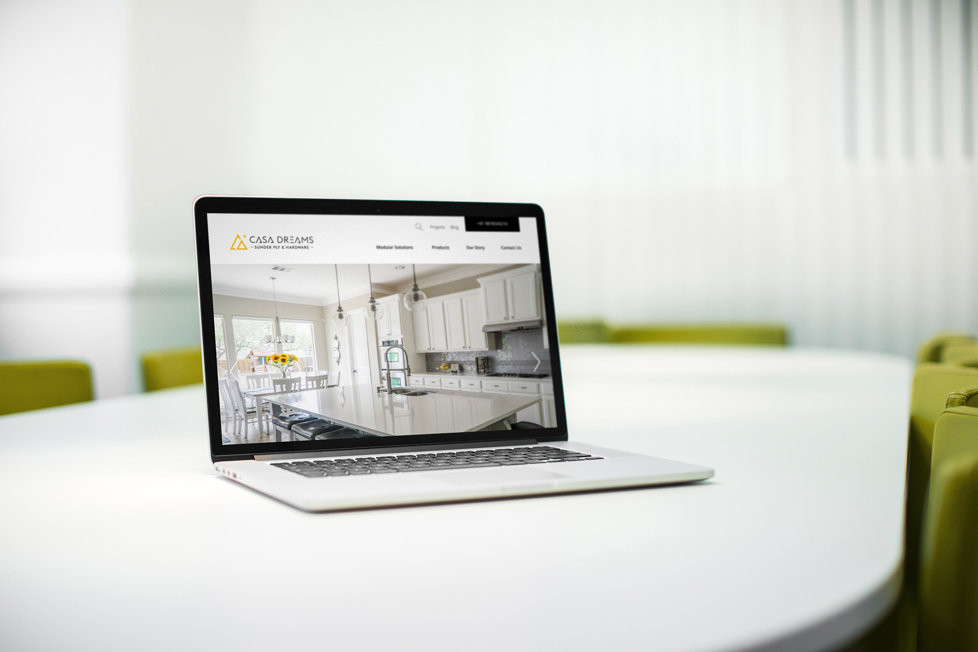
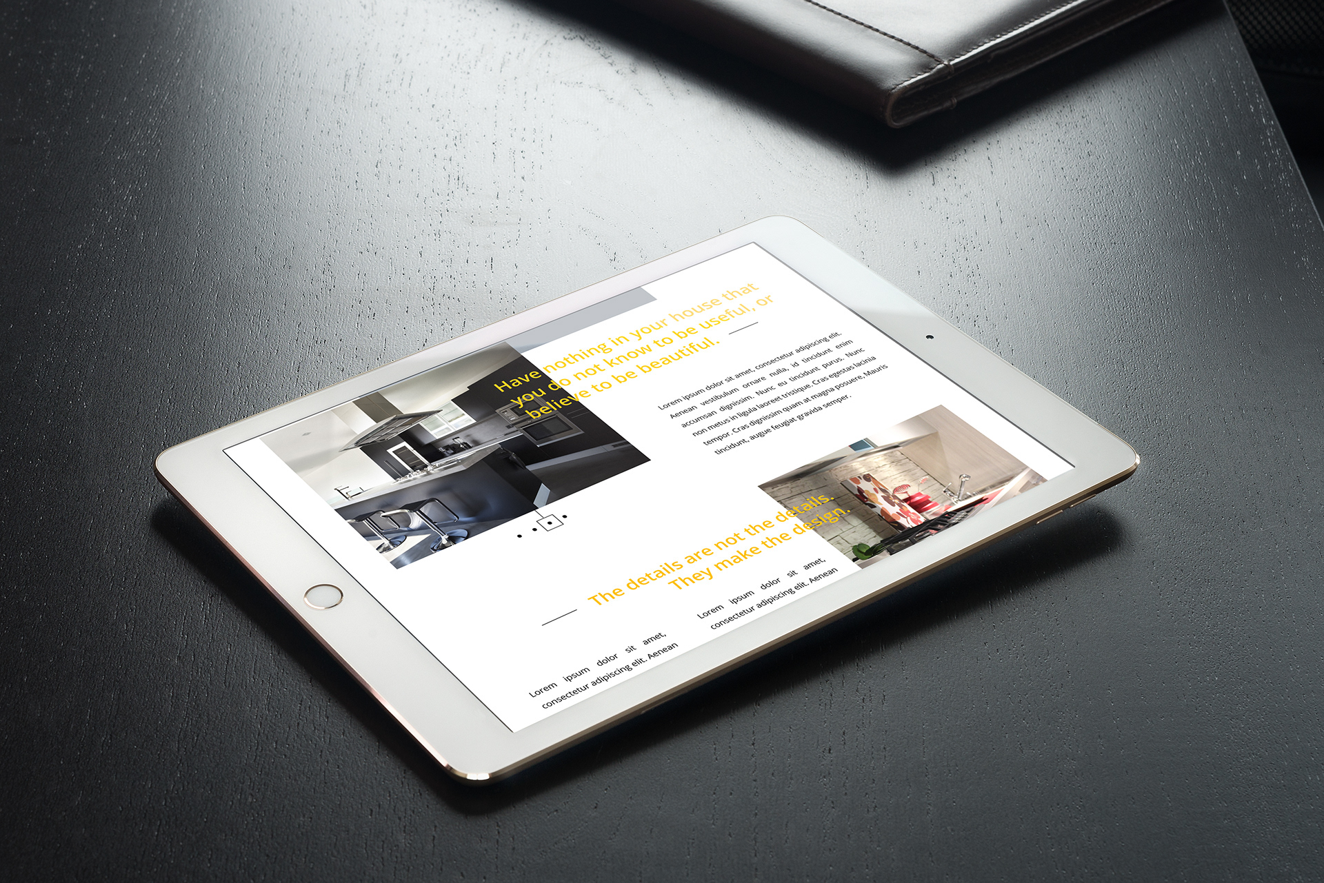
To make the layout less methodical and more interesting, the concept of modular layouts was applied to the hardcover brand book and the website. This gave it a spacious outlook, giving high priority to grids based on interior space layouts.


